Challenge:

American Art Clay Co. is nearly a hundred year old company. As you can imagine over a hundred years in business, much has developed, faded away, but also stayed. Even with the immense history, there was not much in way of structure and standards in their branding, design, and image. The challenge was to create a guideline to help future designers and freelancers know the standard direction AMACO is moving and how they present themselves, from the tone of voice to typography and so on.  

SOLUTION:

This project was in need of a detailed book with everything spelled out for people who were new to the brand, but also a poster form that could be a short hand reminder for the the staff in the office. Between research, asking the current staff what they were looking to move towards, along with my previous knowledge from working a year and a half with the company, I was able to layout how the company was looking to present themselves in the future. 


poster...

style guide excerpts...

challenge:

Produce a brochure that highlights all of the underglazes, low fire glazes, and high fire glazes that AMACO sells. Each glaze line should display the colors available, the safety information, a sample piece of the glaze being used, and the strength of that particular glaze. 

SOLUTION:

When people are searching for which glaze or underglaze to choose for a project, they want to see samples of how the glaze appears after firing, which is why the photographs are a central variable to this catalog. The photos are in more natural settings opposed to a standard gray gradient backdrop so buyers can relate to these pieces more and see the creations in their own home. This decision was made because even though artists are part of our audience, teachers and hobbyists are the majority of our target audience. 

The firing chart on the third page is an infographic that was created to help viewers understand the range of each glaze when firing. Some customers, like teachers, may only do cone 05 firings in their schools so this infographic would allow them to narrow down which glazes would work for their classroom. This image starts the organization of the glazes, but the whole catalog is also structured to separate products by firing range.  

challenge:

With multiple glazes being released for the first time, each glaze family needed a personal identity that could span across all types of media. Glazes that were previously released also need a new spin on previously existing material.

SOLUTION:

After becoming very familiar with each glaze, their highlighted qualities, the chip designs, and historical influence, I worked to essentially branding each glaze by working with our team to create color palettes, layouts, typography, etc. 


SAtin mattes

glaze introduction ad, mixing ad and brochure


shino glazes

glaze introduction ad, Shino layering ads, social media images for both


velvet underglazes

a comparison ad to highlight the color differences when fired at cone 05 vs cone 5


celadon glazes

mixing celadons ad; layering celadons brochures, ads, and social media images

Challenge :

Create a visually appealing branding for artists, and to serve artists. The Bazaar Suitcase is an organization that travels to find artisans working in their remote homes and give these craftsmen a global audience.  This branding consistency is needed across the website, social media, and printed materials. 

Solution :

With a simple, clean logo it allowed the artisans' work and the documentation of these foreign locations to shine. The photography was a huge component for the branding of this organization. Since these worlds are so different than our own,  a viewer can not help but be intrigued with images of the artists, their work, and their lives. Expense sheets are also included in some of the posts. These infographics helped simplify the idea of budgeting into a manageable figure.

challenge:

In need of an innovative paper promo that pushes the boundaries. Keep in mind that paper promotion pieces can be quite extravagant so do not limit ideas based on how expensive this piece would be to produce.

SOLUTION:

Plantable paper was the focus of this promotional piece. The book cover is a durable piece that contains all of the vital information such as the company name, contact, and the paper products being promoted. The inside gives the client samples of different papers with all of the specs on the back. It also informs the client about the business on the front of the papers. The binding is a post binding so the client can take out the samples that are sewn together in order to sow their own little plot of garden after they are done reading the given information.


PROBLEM:

Create a book cover and case. 
Book chosen: Extremely Loud & Incredibly Close
 

SOLUTION:

A major focus of this piece was centered around the interaction the case played on the cover and vice versa. Cut outs were used to create this interaction between the pieces. For example, when you look at the cover, the light seeping out under the door symbolizes the twin towers. When the book is placed in the cover, the light recedes to represent the towers falling. A similar cut out method is carried onto the back as a key appears after placing the book in the case. The font choice is reminiscent of words cut out of magazines or newspapers. This choice reflected the father's actions in the actual book.

CHALLENGE:

Create a campaign that highlight's Brent Wheels & Equipment's tagline : Made in America.

SOLUTION:

The marketing team wanted to highlight the people who make our slogan "Made in America" mean so much. By giving a face to our factory workers who have spent many years dedicated to creating the best quality wheels on the market, we were able to provide a "How it's made" view of the product, but also to help customers realize the people they are supporting through their purchases of Brent products. This campaign help our customers understand all the detail in each wheel and the people behind the craftsmanship, but it also gave our workers a moment to shine and take pride in their work. They demonstrate what brent is all about: providing a reliable, quality wheel. These are Midwesterners, these are just a few of the hard working people of America. 

The video was the center piece of this campaign. Print ads and social media images were published to direct the audience to the website. 


Brent: Handcrafted in America Meet Nelson! He's a CNC Machinist helping refine the wheel heads for Brent wheels. Watch to see his process and hear his view on what handcrafted means to him!
Brent: Handcrafted in America Meet Tom! He's one of our welders here at AMACO/brent. He works to provide a strong connection between each metal component so AMACO/brent supply strong, reliable wheel to each customer. Watch to see his process and hear his view on what handcrafted means to him!

challenge:

Create a CD case and promotional piece. Musical choice: the band MGMT and the album “Connect the Dots”

SOLUTION:

When first thinking about this band, the song “Electric Feel” immediately popped into my mind. I used this song as inspiration for the photo experimentation with light and the vibrant color scheme. All of the photography was original and the lyric book was hand bound. I also played off the “Connect the Dots” album name in the design of the CD case and promotional poster. The plexiglass was all laser cut, but the promo poster had acrylic paint rubbed into the rasterized words and graphics.

challenge:

Design a portfolio site for a ceramic artist.

SOLUTION:

After consulting the artist on what she was looking for, I set to create a clean and effective site that would highlight her work. The looping portfolio allows viewers to continuously cycle through to the next project without even having to scroll to the top. The artist also provided the atmospheric photos upon request to bring lifestyle into her functional ceramics. This created an enticing contrast from pieces being works of art in a museum setting, to works of art that are meant to be used in the home. The logo was influenced by her signature and a pattern she uses frequently in her work. 


challenge:

Code a reflexive website that can be used as a tool for self promotion.

SOLUTION:

Used HTML and CSS coding to build a reflexive website that served as a portfolio website. The site highlighted two sections of work : design and fine art. You could sort projects in each category based on what you were interested in, therefore, if you only wanted to see "branding" or "video" projects, it was possible with the click of a word. You could also simply arrow through the projects. A resume and contact information was also available though the "about" page.

challenge:

Create a unique but clear infographic based on the connections made between Post Modern Designers.

SOLUTION:

Each designer is listed on the left and each connection is color coded at the bottom. The colors fill in the letters for “Post Modern Design”, which have a slight arch to them to make the letters pop off the page.

challenge:

Create a branding campaign for a potential business. Maintain a consistent theme, style, and color scheme from piece to piece so the campaign is cohesive.

SOLUTION:

Vintage Cycle is a bicycle shop that is located along a major bike trail in Seattle. The store has a vintage vibe and so does the product. The brand maintains a limited color pallet and a clean and sophisticated style. This campaign includes packaging, map design, letterhead, signage, and poster design.

challenge:

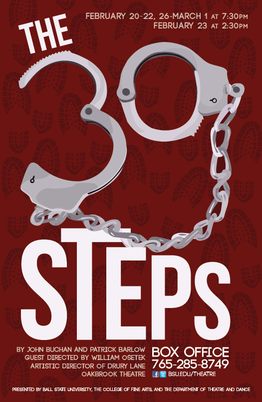
After brainstorming the best way to approach the 2013-2014 season, the decision was made that there may not be a connecting theme, but there could be a unified style to represent the season.

SOLUTION:

The Herman Miller style was decided upon to unify the posters, banners, and program covers for Ball State's Theatre and Dance Department. This was a promising approach to relating such a wide variety of shows that otherwise had limited connections.


all 10 posters